Market Perspectives – February 2018
Capital Markets
Due to early February market volatility; we have decided to write this article using February 9th data. After one of the best starts to a year in history, the stock market finished January up 5.7%, marking the 15th consecutive month in which the S&P 500 posted a positive total return. The market posted all-time highs on numerous trading days in January before posting its most recent all-time high on January 26th. In the first week and a half of February, U.S. stocks have returned -4.7%, giving up all of the 5.1% gains from January.
In most years, we see an average of three drawdowns of more than 5% and typically at least one greater than 10%. Consequently, we were surprised that it hadn’t happened in so long. We see a market pullback as a healthy part of the process.
Investors have grown concerned that we will see increased inflation which could push interest rates higher and pressure equity prices. While possible, it is worth noting that inflation has been extremely stubborn and well below target for years. Early data only suggests a mild pickup in inflation, not an unexpected jolt. While anything can happen, we are not necessarily concerned that this is the beginning of a large bear market. A few thoughts:
- There have been 30 pullbacks of 10% or more since 1957 and only 6 have led to bear markets (more than 20% drops). During this bull market which started in 2009, we have had 9 drops of more than 5% and 5 drops of more than 10%.
- The yield curve has steepened recently which is usually a healthy sign for the economy. An inverted yield curve has been a great predictor of a recession. We aren’t there yet.
- High yield bonds typically perform poorly leading into a bear market. This time, high yield has held up much better than stocks.
- According to the Leuthold Group, most bear markets occur when certain momentum indicators have broken down. The current market doesn’t exhibit these signs.
- Tax reform has pushed a massive stimulus bill into the economy. We have yet to see the impacts of tax reform, but the new law should deliver significant stimulus to the corporate sector.
- Stocks just got cheaper. The recent drop in stock prices plus expected earnings growth from tax reform puts the forward Price-to-Earnings at the cheapest levels we have seen since early 2016 (albeit still elevated).
Defining Risk is Easy, Quantifying Risk is Hard
This past week, we saw a complete tsunami of the short volatility crowd. We wrote about this phenomenon in the January Market Perspectives and warned there were major risks lurking, but had no idea when the risks would present themselves. We updated the short Vol ETF chart. In just 36 hours, the short Vol ETFs lost more than 94% of their values the week of February 5th.
The definition of risk is simple: the probability there will be a permanent loss of capital. Unfortunately, the investment community hasn’t been able to adequately quantify risk. Instead, many practitioners simply use one statistic, standard deviation. While we think standard deviation is a useful measure for portfolio modeling, there are limitations. A few thoughts:
- Standard deviation measures volatility (variability of returns) which is useful in giving investors a general idea of how much an investment might fluctuate.
- One problem with standard deviation is that it is only useful if the investment returns are normally distributed on a bell curve.
- Investments with non-normal distributions can be very high risk but have very low standard deviations. Examples include: options selling, insurance linked securities, catastrophe bonds, and distressed debt.
- Standard deviation is also flawed with respect to measuring leverage and illiquidity risks. In recent years, we have seen some investment firms try to argue that private equity and private debt are less volatile because they have lower standard deviations. This is quite misleading. If these assets were priced every second like the stock market, they would exhibit very high standard deviation.
- Standard deviation isn’t the only flawed risk metric. There are many. In 2008, the financial system largely collapsed because risk teams had created flawed models based on a metric called VaR (Value at Risk). VAR ignores the magnitude of a black swan event and when that event happened, it crippled our financial system.
When it comes to risk, we do our best to use metrics that help us understand the probability of a permanent loss of capital. When results don’t add up, we try to figure out what unmeasurable risks might be lurking.
By: Dustin Barr, CFA
The information published herein is provided for informational purposes only, and does not constitute an offer, solicitation or recommendation to sell or an offer to buy securities, investment products or investment advisory services. All information, views, opinions and estimates are subject to change or correction without notice. Nothing contained herein constitutes financial, legal, tax, or other advice. The appropriateness of an investment or strategy will depend on an investor’s circumstances and objectives. These opinions may not fit to your financial status, risk and return preferences. Investment recommendations may change and readers are urged to check with their investment advisors before making any investment decisions. Information provided is based on public information, by sources believed to be reliable but we cannot attest to its accuracy. Estimates of future performance are based on assumptions that may not be realized. Past performance is not necessarily indicative of future returns. The following indexes were used as proxies in the performance tables: Global Stocks = MSCI ACWI; U.S. Large Cap = S&P 500; U.S. Large Value = Russell 1000 Value; U.S. Large Growth = Russell 1000 Growth; U.S. Small Cap = Russell 2000; Int’l Dev Stocks = MSCI EAFE; Emerging Markets = MSCI EM; U.S. Inv Grade Bonds = Barclays U.S. Aggregate; U.S. High Yield Bonds = Barclays Corporate High Yield; Emerging Markets Debt = JPMorgan EMBI Global Diversified; Int’l Bonds = Barclays Global Treasury ex US; Cash = 3month T-Bill; Sector returns displayed in the chart represent S&P 500 sectors, while treasury benchmarks are from Barclays
Quote of the Month
“I don’t think investors fear volatility, what they fear is the possibility of permanent loss.”
Howard Marks
Chart of the Month
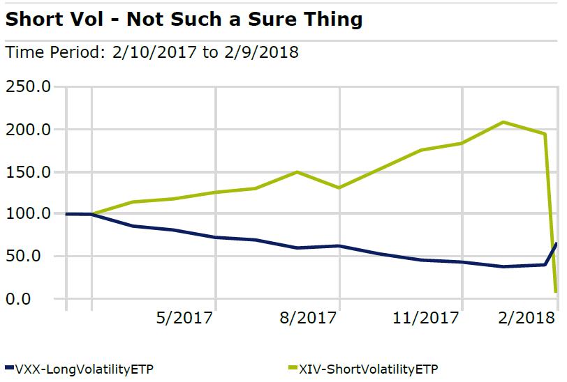
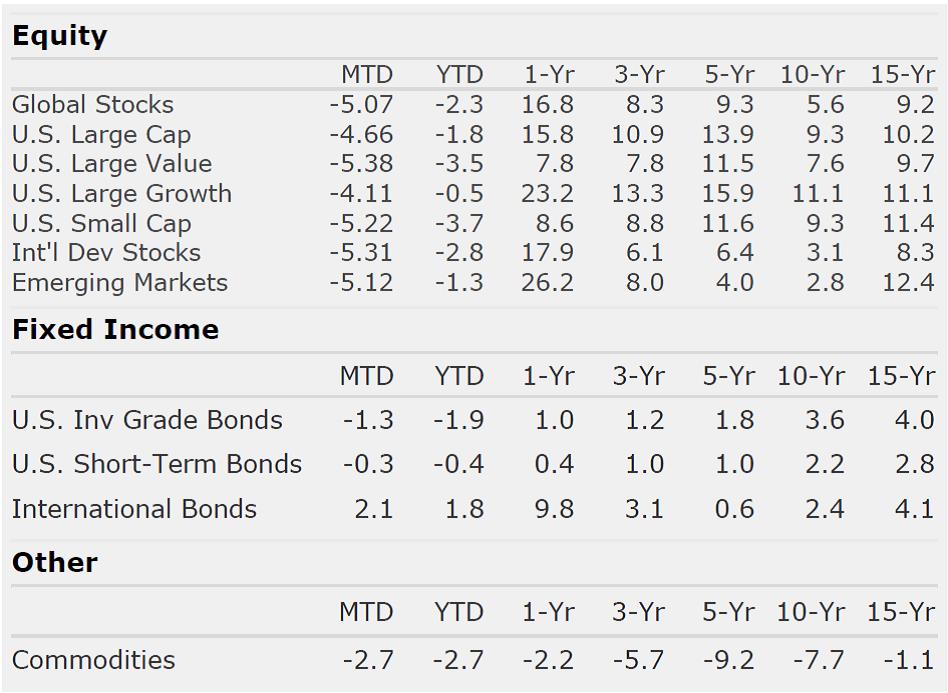
Chart of the Month
Quote of the Month
“I don’t think investors fear volatility, what they fear is the possibility of permanent loss.”
Howard Marks
Trailing Returns