Market Perspectives – October 2018
Capital Markets
The third quarter was a good one for stock investors. The S&P 500 posted a 7.7% return in Q3, with large cap growth stocks again leading the way with a 9.2% return on the quarter. Value stocks continue to struggle. The gap between value and growth has been a slow and painful slog for the value investing community. On a 15 year trailing return, large cap growth stocks have the highest return of any equity segment on our board, including small cap and emerging markets stocks. The utter dominance of just a few key growth stocks has been nothing short of impressive.
If value has trailed, then international and emerging markets stocks have been trounced. Their performance in 2018 has been a disappointment. While the S&P 500 is up 10.6% on the year, emerging markets stocks are down 7.75%. These stocks have underperformed for a number of years, but last year they posted tremendously strong returns. Historically, when we see such strong leadership change we expect to see the new leadership continue for a long period of time. This time around, it didn’t happen.
Fixed income is on pace for its worst year since 2013. The Fed raised rates again in September bringing the Fed Funds rate to 2.25%. As we have noted in the past few Market Perspectives, the yield curve has been extremely flat in recent months. The 10-year Treasury bond had largely hovered around 2.8% during 2018 as short-term rates marched higher. The final week of September (and the first week of October) finally forced longer rates higher with the 10-year treasury closing above 3.2% on October 4th.
The good news is that higher interest rates mean higher future expected returns. It’s likely that higher rates are due to the strong economic growth we are seeing this year as the economy absorbs the large fiscal stimulus that was pushed through last year. If longer term interest rates stabilize near current levels we would view the move as a positive. Not only will there be higher expected returns in fixed income going forward, but the Fed will have more room to raise rates. Higher rates mean higher competition for risky assets. For a decade, investors have been accustomed to accepting lower yields on risky assets. As treasuries pay returns again, the attractiveness of certain asset classes may dwindle. We realize fixed income hasn’t paid much in past years, but we would strongly argue that high quality fixed income should be a part of a diversified portfolio.
Lies, Darned Lies, and Statistics
There have been plenty of news articles and media pundits this year who have pointed out that midterm election years tend to generate lower market returns than the other three years. A few thoughts:
- We decided to do our own analysis through Morningstar Direct. We compared annual returns from 1971-2017. The average annual return in the market during this time period was 12.12% and the median was 15.06%. During these 47 years, the highest annual return was 37% (1995) and the lowest was -37% (2008).
- At first blush, we agree with the news articles. The midterm election years have produced an average annual return of 6.32%, half of the average of the full 47 year sample.
- As we dug in a little deeper, we noticed that the median midterm return was 13.69%, approximately 1.4% lower. This is obviously a much lower gap than the average.
- The three worst returns in the 47 year period from 1971-2017 were -37% (2008), -22.1% (2002), and -26.4% (1974). 2002 and 1974 were each midterm election years. These two years alone pull the average midterm election year down to 6.32% from 13.12% and the median adjusts to 15.06%.
- 1974 was the year of the oil embargo. We doubt many observers would blame the mid-term election of 1974 on the poor stock market performance. Further, 2002 was the third year of negative stock market returns. This was following the dot com bubble bursting and on the heels of the 9/11 attacks in New York, Washington D.C., and Pennsylvania.
- When we take out these two negative returns from the broader average, the average number improves to 13.74% and the median is 15.79%.
- The point of this article is that there isn’t a story here at all. After accounting for two random years, the difference is insignificant.
- We are all wired to try to find explanations. We all want simple statistics to tie back to simple stories. It’s the human condition. Be wary of making investment decisions based on narratives, particularly narratives based on ever so convenient, overly simplified statistics.
By: Dustin Barr, CFA
All data sourced from Morningstar Direct unless otherwise noted. The information published herein is provided for informational purposes only, and does not constitute an offer, solicitation or recommendation to sell or an offer to buy securities, investment products or investment advisory services. All information, views, opinions and estimates are subject to change or correction without notice. Nothing contained herein constitutes financial, legal, tax, or other advice. The appropriateness of an investment or strategy will depend on an investor’s circumstances and objectives. These opinions may not fit to your financial status, risk and return preferences. Investment recommendations may change and readers are urged to check with their investment advisors before making any investment decisions. Information provided is based on public information, by sources believed to be reliable but we cannot attest to its accuracy. Estimates of future performance are based on assumptions that may not be realized. Past performance is not necessarily indicative of future returns. The following indexes were used as proxies in the performance tables: Global Stocks = MSCI ACWI; U.S. Large Cap = S&P 500; U.S. Large Value = Russell 1000 Value; U.S. Large Growth = Russell 1000 Growth; U.S. Small Cap = Russell 2000; Int’l Dev Stocks = MSCI EAFE; Emerging Markets = MSCI EM; U.S. Inv Grade Bonds = Barclays U.S. Aggregate; U.S. High Yield Bonds = Barclays Corporate High Yield; Emerging Markets Debt = JPMorgan EMBI Global Diversified; Int’l Bonds = Barclays Global Treasury ex US; Cash = 3month T-Bill; Sector returns displayed in the chart represent S&P 500 sectors, while treasury benchmarks are from Barclays
Quote of the Month
“Facts are stubborn, but statistics are more pliable.”
Mark Twain
Chart of the Month
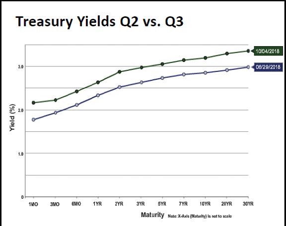
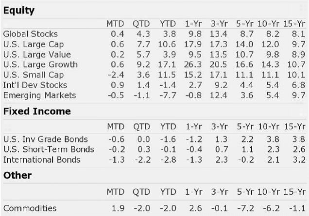
Chart of the Month
Quote of the Month
“Facts are stubborn, but statistics are more pliable.”
Mark Twain
Trailing Returns